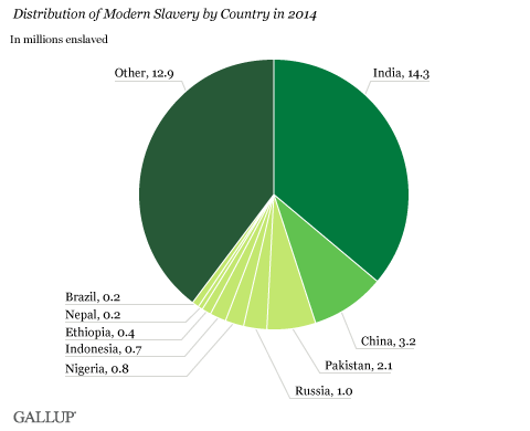
I’ve added RSS feeds from blogs about librarians, data, and data visualization to Feedly recently, which I was going through the other evening. When I came across this particular picture, though, I paused.
What do you notice about it?
First off, I know that India, China, and Pakistan are some of the most populated countries in the world, while other countries chock-full of people don’t make this list. Why?
This has me wondering if anyone’s looked at number of slaves compared to the population. I can’t easily find the source of this data on the endlessly scrolling blog… but finally I find hidden dots in the corner. Oh yes. That’s it.

Turns out the source is an article by the Gallup polling service, with a pie chart of number of slaves per country. Pretty sure that’s what @Jishai flipped into the pretty bars above:

What else is going on?
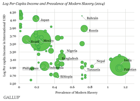
But Gallup gives us more than just slaves. The agency also graphs income per person against the percent of a country that’s enslaved, noting:
“Even within countries with similar incomes, there are varying degrees of modern slavery. A country such as Bahrain, where 0.71% of the population is estimated to be in slavery, has a much greater per capita income than a country such as Tanzania, and yet the prevalence of slavery is estimated to be similar.”

They raise several factors–but don’t really discuss migration. My thought at this point is that we can’t look at population without migration. Slaves in Russia are likely migrants from Central Asia; slaves in Bahrain may be from India or poorer parts of the middle east. Slavery is justified because someone comes from ‘outside’, whether by class, income, ethnicity, place of birth, or race (I’m thinking of Graeber’s Debt, a book I’ve summarized here). This means that some slaves may not be citizens of the country they inhabit–so how do we estimate their number, and their relation to the ‘official’ population numbers?
So where are these numbers from?
Gallup went deeper. In a second round of research, they drew data from:
“face to face interviews with 8,061 adults, aged 15 and older, conducted in May and June 2014 in Brazil, Ethiopia, Indonesia, Nepal, Nigeria, Pakistan and Russia” (Gallup).
As they framed it, they chose 7 countries, “…prioritized because of their high vulnerability and their potential for having a large number of people in modern slavery.”
I wondered why they didn’t interview in India, the runaway slaveholding state. Were countries chosen because they were easier? Because people were vulnerable to what?
…and indeed, if you move from Gallup’s overview to their Global Slavery Index 2014, there are 150 pages on how and why each country struggles with slavery, including eye-opening visuals, charts, pictures, and stories:

Lots to explore in the future. For now, I go back to Gallup’s review post, which mentions the challenge of interviewing hidden (and, umm, enslaved) people. They did this by sampling social networks in 7 countries, asking if people knew where their relatives were:
“Gallup used a network sampling methodology to circumvent these problems. Network sampling gathers information about an individual’s carefully defined family network, including those who may be living elsewhere. Gallup developed a questionnaire with Walk Free to reliably identify cases of modern slavery among this family network.”
In sum, Gallup and Walk Free interviewed 8,000 people in 7 countries to learn about possibly slavery in their family networks. There’s a lot of good stuff in the full report, which you can read on your own, but I’d like to focus again on the data visualizations.
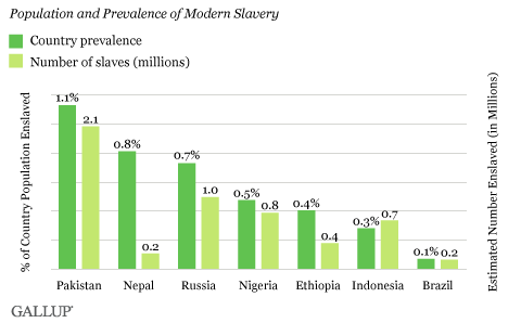
In their blog post, Gallup gave the following estimates for the 7 countries interviewed. The darker green is percent of population in slavery; the lighter is the raw number of slaves:
This suggests 2.1 million slaves in Pakistan, or 1.1% of the population. UN population prospects note 173 million Pakistanis in 2010 (.xls); there are some 189 million today (Wikipedia, via population clock).
As an aside, the UN population data page also includes things like the old-age dependency ratio, which I threw into a chart below. This shows that that as of 2010, Pakistan has 7 elders for every 100 people aged 15-64:
I’m not seeing any trend here of slaves being in old-age states, which was my casual hypothesis. Japan… well, Japan is a whole separate issue.
On visualization:
Instead I’ll turn back to visualization. Take another look at these two graphics:
And:
Both have their strengths and weaknesses. In the very first chart by @Jishai, note how India’s fourteen million slaves jump out. The bright numbers look high, with millions of people enslaved in India, China, and Pakistan. It’s simple and effective… although it leaves out a lot of detail or obvious links to context.
But in Gallup’s graph, similar numbers look low: only 1.1% of the population, 2.1 of …something. There’s more data, but it’s not better displayed. I find it disorienting to see percentages and millions of people graphed side by side.
So in this case I’m not sure which is better. As with any data visualization, the authors are making decisions: which facts are important? what do we highlight and what do we downplay? what emotions or decisions do we want people to walk away with?
Re-Visualization as Improvement
But to give Jishai credit, there are other instances where re-visualizing data really does add something. Take this chart by the CDC, on number of farmer’s markets per 100,000 people:

There’s a lot I like in the chart above: more farmers markets mean a darker state; the data source and citation are clearly shown; small states are highlighted so you can see them better.
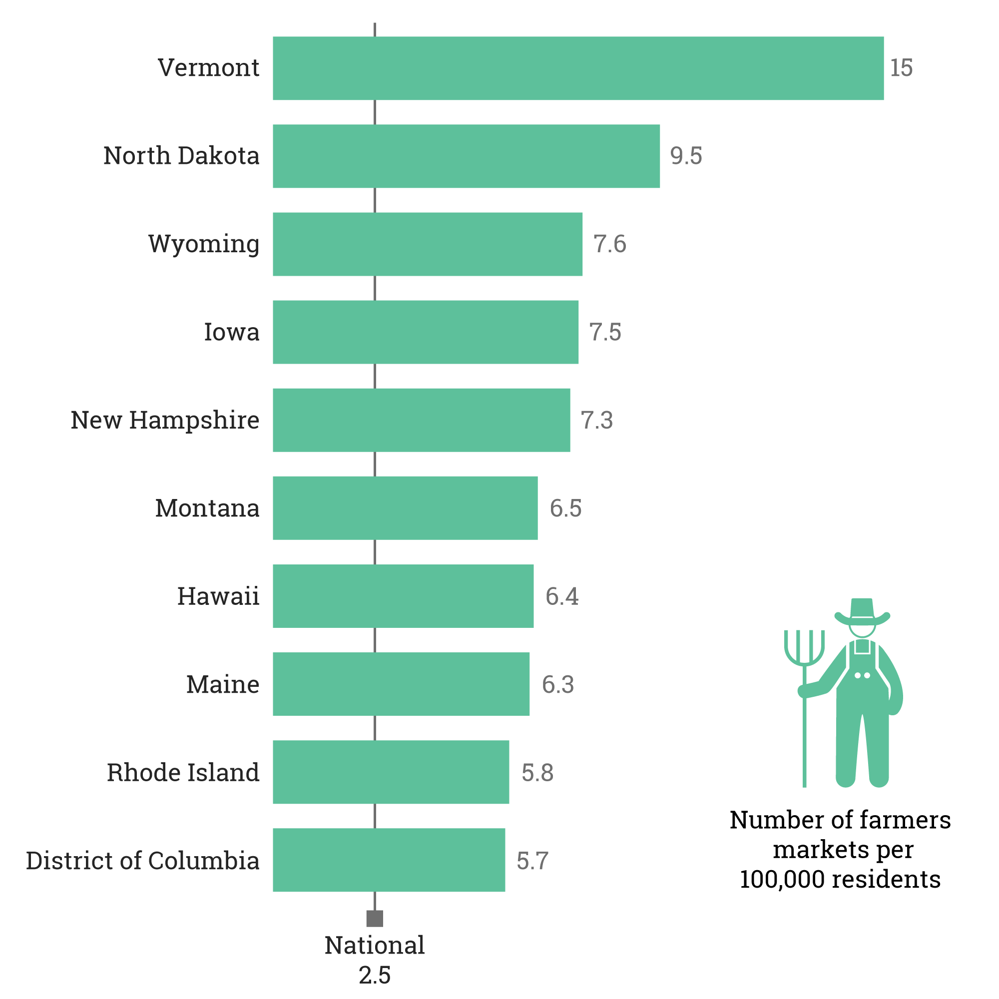
But in other ways, it’s too much. That’s where Jishai has done a great job in re-visualizing:

After playing around in Illustrator, he’s made it easier to read. I clearly see which states have the most farmer’s markets per capita (seems to be rural and low-population states), and I love that it’s laid against a subtle national average line. A small farmer reinforces what the graph is about.
Two sets of data, and two visualizations and re-visualizations. In the first set, I’m not convinced that the remake was better–but in the second, it clearly was. In both cases, it’s clear that data authors make choices about what information they collect, and illustrators make choices in what they highlight. Sorting out and re-thinking these choices is part of what we mean when we talk about “data literacy” and a “data-literate nation.”
Explore the data yourself:
- CDC on Farmer’s Markets (and tons of other health stuff)
- Gallup blog post on slavery
- Gallup report on slavery
- UN population statistics
- World bank population statistics (more attractive + easier to use)
Comments or visualizations of your own? Comment below, or tweet at @celiemme.


Gallup’s side-by-side column chart of prevalence and population by country suggests that as prevalence decreases, so does the modern-slave population. This would be a tautology if these countries all had the same total population. By omitting Pakistan, China and India, Gallup’a graph suppressed the outliers. A better graph would be an XY plot of prevalence versus slave population. India would clearly be seen as the “leader” on both scales with Pakistan as #2 in prevalence. Unfortunately, none of the graphs provide any causal insight as to why India, Pakistan and Nepal have the highest prevalence of modern slaves.
Thanks for your comments, Milo — I think you’re right that these graphs aren’t giving the full picture. Gallup’s report may have more information, but it’s not going to be circulated and shared as easily.