A few months ago, I took my bike in for repairs to a local business, where the friendly and tattooed owner began chatting me up. Filling out forms extremely slowly, he told me all about his businesses, his son’s private school, his plans for a custom-build house in Florida and a flat in Manhattan.
“Are you single?” He asked.
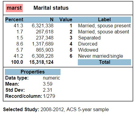
I thought about it for a moment. I ran through the categories from the US Census in my head:
I wasn’t married, divorced, or widowed. So according to the US government, my answer was clear:
“Yeah, I’m single.”
It took most of the walk home, before I realized Mr. Tattoo wasn’t asking for census or demographic data.
…And that by retelling this to my boyfriend later that evening, I probably didn’t meet the popular definition of single.
On Demographic Data
In my defense, I’d spent the past year working as a data librarian, which means thinking by numbers. I’d gotten my job by giving a talk on the US Census, a ten-yearly count of people by location–but I had also learned that counting heads every ten years doesn’t really tell us about current communities. For that, I’d been playing with the American Community Survey, which samples a few households each month to give one- and five-year estimates of changing trends in our communities.
As a data librarian, I’d discovered tons of fun government and social data online. For instance, you can:
- Find Quick Facts about your town online.
- Learn how many children were named John or Mary in 1905, or look up your own name’s popularity over time.
- Find out what we value as a nation, compared to other countries’ beliefs and values (as I did for Kazakhstan!).
- See how our social attitudes have changed over the past 40 years at the General Social Survey.
- Compare businesses, houses, and people in your county or city at American Factfinder.
I had fun learning about the census. In this and the next post, I’ll talk about it, and (hot tips for young ladies and gents!) what we can guesstimate about the dating prospects for the single–or not so single–people in our lives.
Data and Dating
When my mother heard that I was telling young men my census marital status, she shipped me a copy of Data: A Love Story, which advocates a more number-crunching approach to love. A friend in Malaysia shared a Facebook link to Dateonomics. Apparently people are now weighting variables in their love lives, checking their instincts against the demographic data.
This just made me more curious. Where are all the single people? In my small college town, I hadn’t found many terribly compelling guys. I explored online dating profiles. I went out with a mortgage lender, an ice cream shop manager, a night watchman, a professor, a history teacher. These guys were gentlemen (or gently awkward)… but was I really meeting a fair sample of my dating pool?
So one snowy night, I decided to use my data powers for good. I would use census microdata to survey my local region of Maine. There’s a lot that you can do with summary statistics from the census at American Factfinder, but I wanted more control over how I subset and extracted the data. For that, I needed to register with SDA and compare the variables myself.
Who’s Married in America?
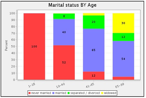
First, I decided to find out who was available. You saw above that recent American Community Survey estimates are drawn from 15 million people surveyed in 2008-2012. Their survey answers are weighted against our whole population to estimate how many of America’s 305 million people are currently married or divorced. So 1,300,000 currently-divorced folks in the sample becomes 32,000,000 American divorcees, or about 10% of the nation. By playing with online charts in SDA, I can further break down marital status by age group:
[Technical note: register here to use 2008-2012 ACS data on the SDA website. I input row: marst(r: 6 “never married”; 1-2 “married”; 3-4 “separated / divorced”; 5 “widowed”), column: age(r: 1-18; 19-40; 41-65; 65-99), and asked for a stacked bar chart. Note that I recoded type of status and 99 years of age into grouped visuals.]
In the graph above, I’m glad to see that close to 100% of American children haven’t yet married. We can also see that some 50% of early adults, 10% of maturing adults, and 5% of the American elderly have never once been married–not even an ill-advised Vegas wedding!
Going Local
That’s great, but I wanted more local detail.
This is challenging, because the Census Bureau doesn’t want creepers to know too much about your family. I can make my own charts of regional data, but it has to represent at least 100,000 people. This is called a PUMA (“public use microdata area”), and there are 10 in the state of Maine (which has just over a million residents). [[Technical note: to see your microregion, use census reference maps. My microregion of Maine was labeled 600 in 2000 and 400 in 2010. Since ACS used the earlier label prior to 2012 (source) and I was looking at the 2008-2012 year range, I went with the earlier label. Yeah, that’s a bit fuzzy, but I’m new here!]]
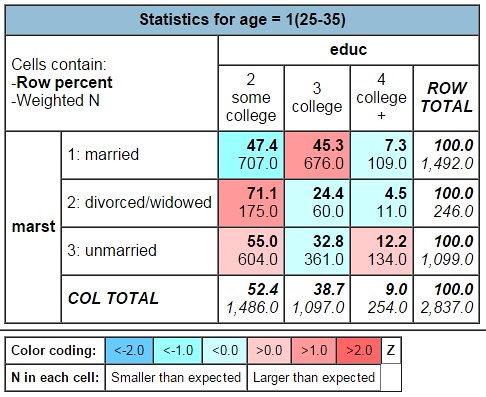
To my complete lack of surprise, I found that most nearby men my age with a bachelor’s degree were already married:
[Above, I pulled employed men in Central Maine, age 25-35, by marital status and education, using: row: marst(r: 1-2 “married; 3-5 “divorced/widowed”; 6 “unmarried”) column: educ(r: 7-9 “some college”; 10 “college”; 11 “college +”) and filter: statefip(23), puma(600), sex(1), empstat(1) ].
The results? Among the hundred thousand people closest to me, I found only around 360 employed single men my age with a bachelor’s degree (row 3, col 2), and 130 guys with more than four years of college education (row 3, col 3)
… But that’s a pool, right?
(Having fun? Confused yet? Read on for Part 2: Who’s Single in Maine!)


71% of men with some college aged 25-35 in Maine are divorced or widowed?!? I must be reading this wrong!
I think we’re reading the chart the wrong way. It looks like among the est. 246 divorced, employed men age 25-35 in central Maine, around 175 of them (71% ) had some college. 24% of these divorced men had college, and 4% of these divorced men had 4+ years of college.
If you look to the right, the row total = 100, which indicates that the percentages run horizontally, not vertically! I’m sure I could re-run the table to calculate percentages another way…